An historic institution entering public view needed an identity that reflected its enduring purpose—formal, restrained, and rooted in legacy.
Context
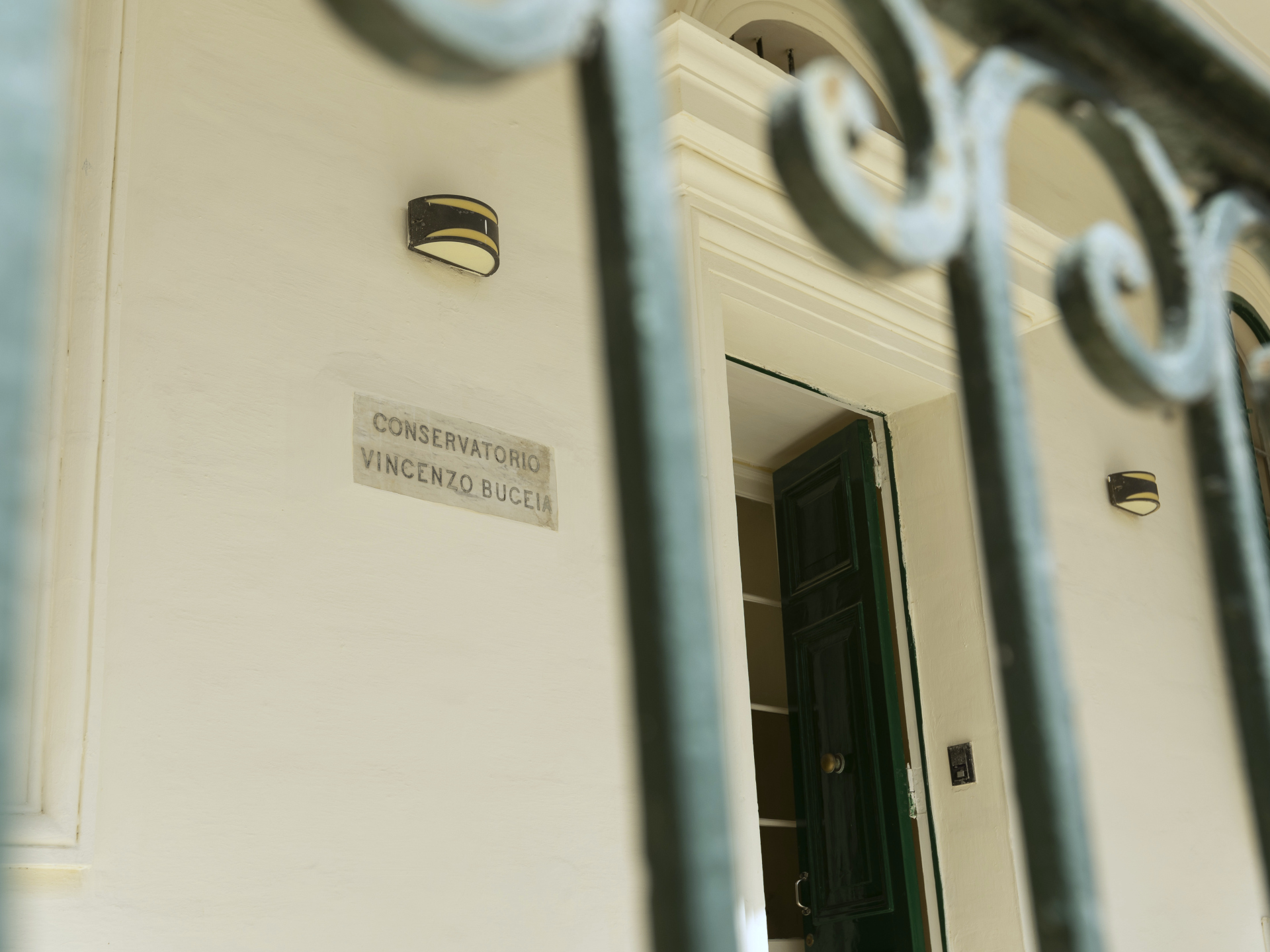
Conservatorio Vincenzo Bugeja had existed quietly for generations—managing properties, fulfilling its philanthropic mission, and remaining largely out of sight. For years, it had no online presence and no intention to engage publicly. But with renewed internal direction, it became clear that the institution could no longer remain invisible. The mission was well established. What was missing was a public face—something clear, formal, and considered to carry its presence into the public domain.
Fit & Intent
This wasn’t about marketing—it was about formality, structure, and alignment. Conservatorio Vincenzo Bugeja didn’t need to be invented. It needed to be presented. The intent was clear: establish a respectful, serious visual identity that matched its institutional weight. A logo was required, but one that respected tradition without defaulting to nostalgia. The process had to tread carefully between heritage, neutrality, and distinctiveness—something that could carry real authority without overstating itself.
Direction
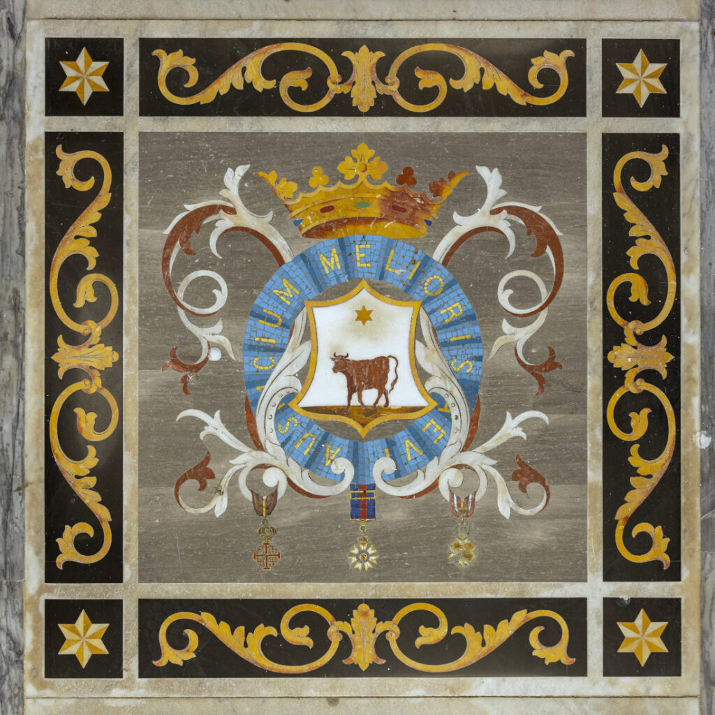
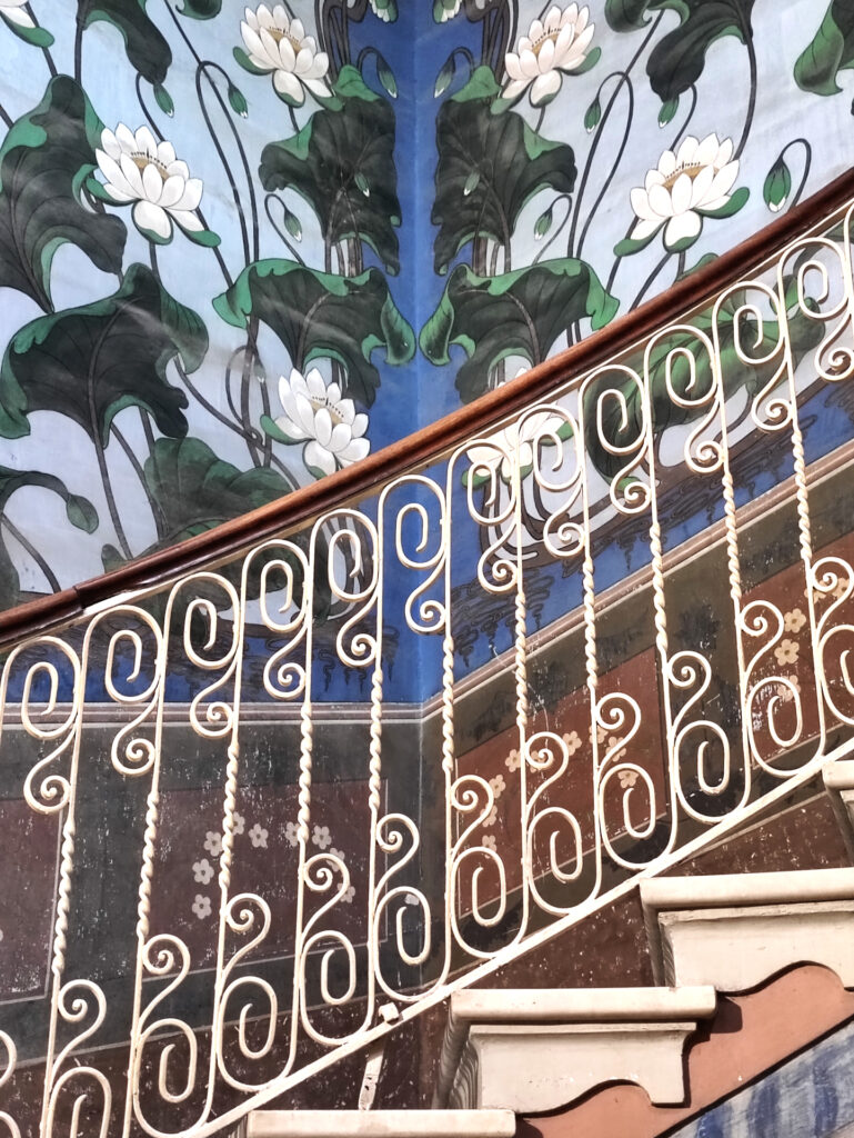
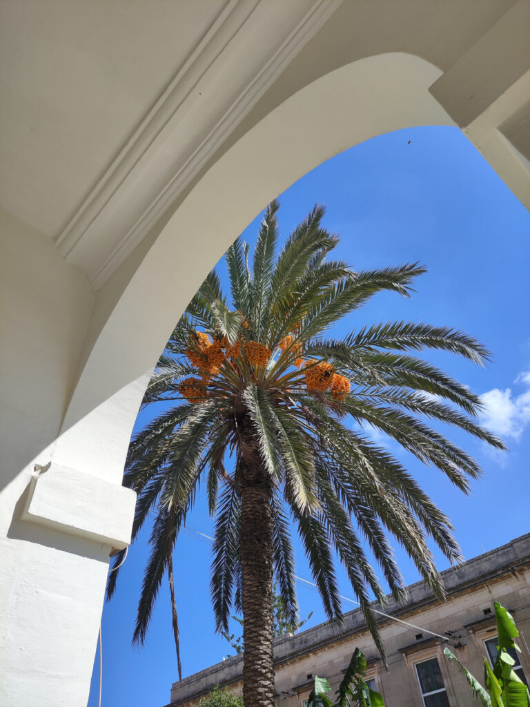
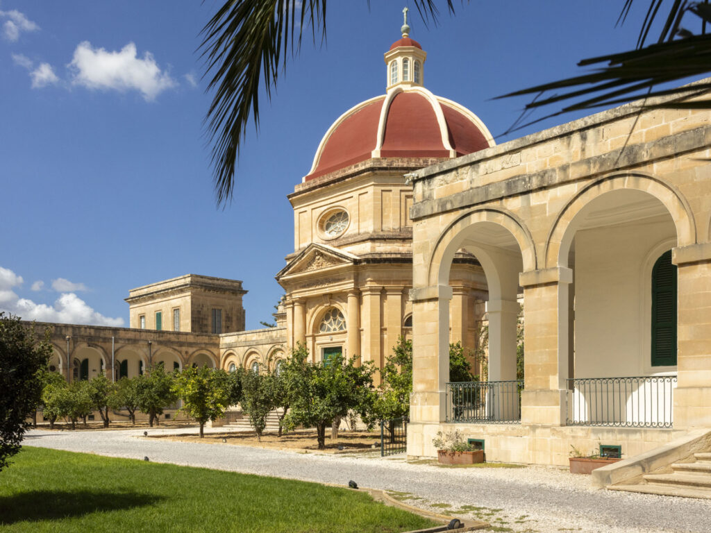
The starting point was the institution itself—its architecture, signs, and visible symbols. Everything pointed toward a brand that needed to feel classical, formal, and established, without becoming decorative or nostalgic. Conservatorio Vincenzo Bugeja has a strong institutional voice rooted in tradition, and the identity had to reflect that—clearly, without noise. The work focused on interpreting existing material rather than inventing something new, always guided by the question: how do we honour legacy while creating tools fit for today’s public presence?
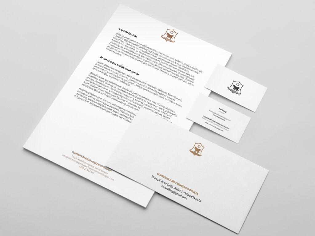
Outcome
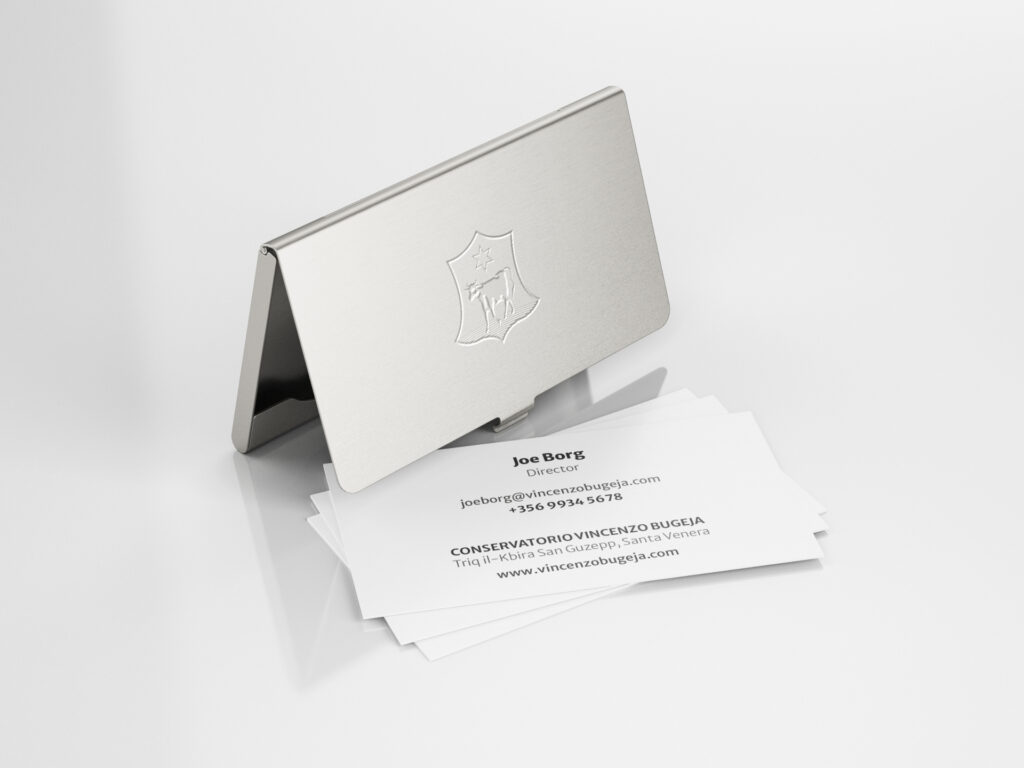
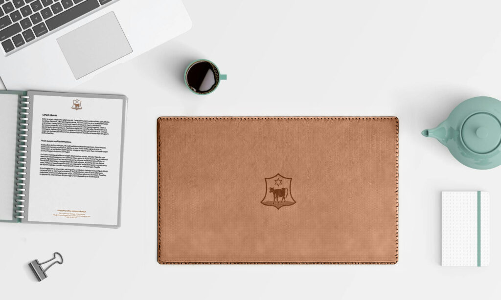
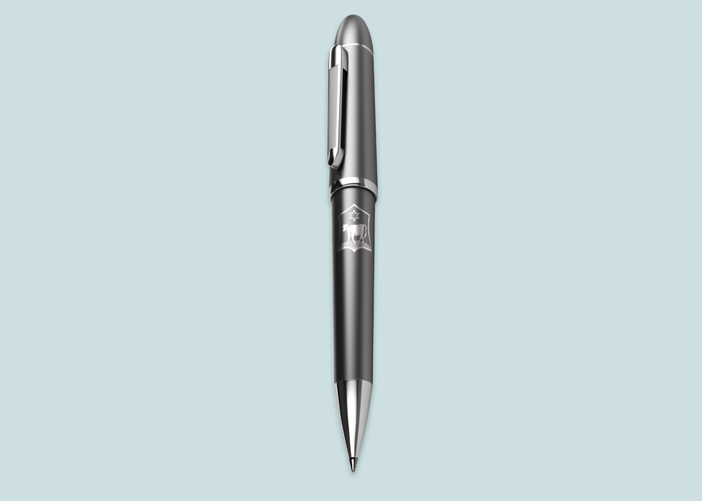
Conservatorio Vincenzo Bugeja now has a complete logo system, made up of a reinterpreted wordmark and a monogram rooted in the institution’s own architectural detail. The formal tone of the identity is reinforced through a restrained colour palette drawn from the apertures of its buildings. Core stationery and templates were developed to standardise communication, alongside a website design that introduces the Conservatorio to the public for the first time. The result is a clear, formal identity that holds its ground—practical, recognisable, and aligned with the institution’s enduring role.